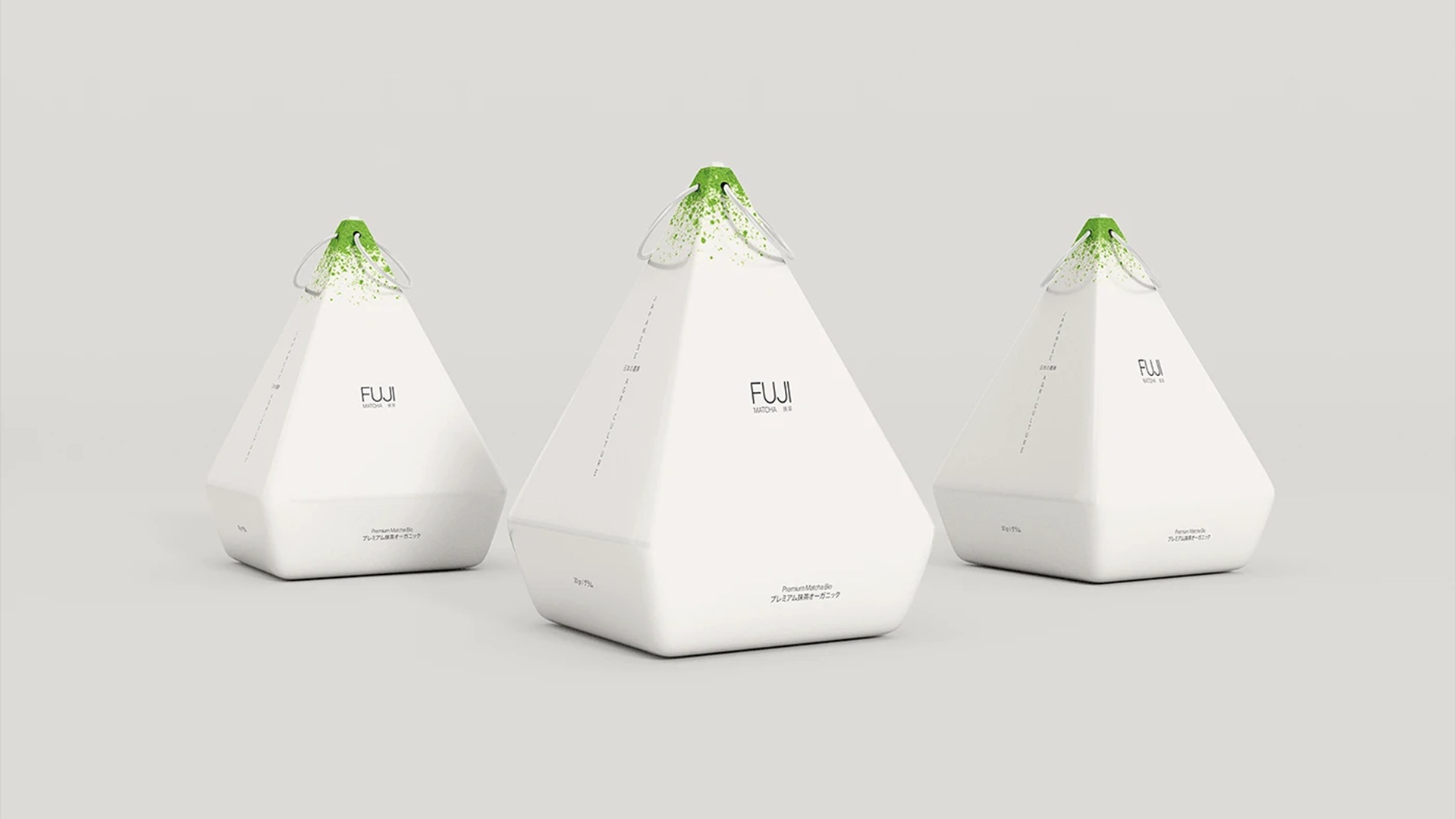
Developed as a concept project, Spanish graphic designer Marco Arroyo-Vázquez set out to craft a packaging design for the popular matcha drink, aiming to translate the tea’s origins into a container that not only tells a story but also makes the product stand out on the shelf, easily – and instantly — grabbing consumers’ attention.
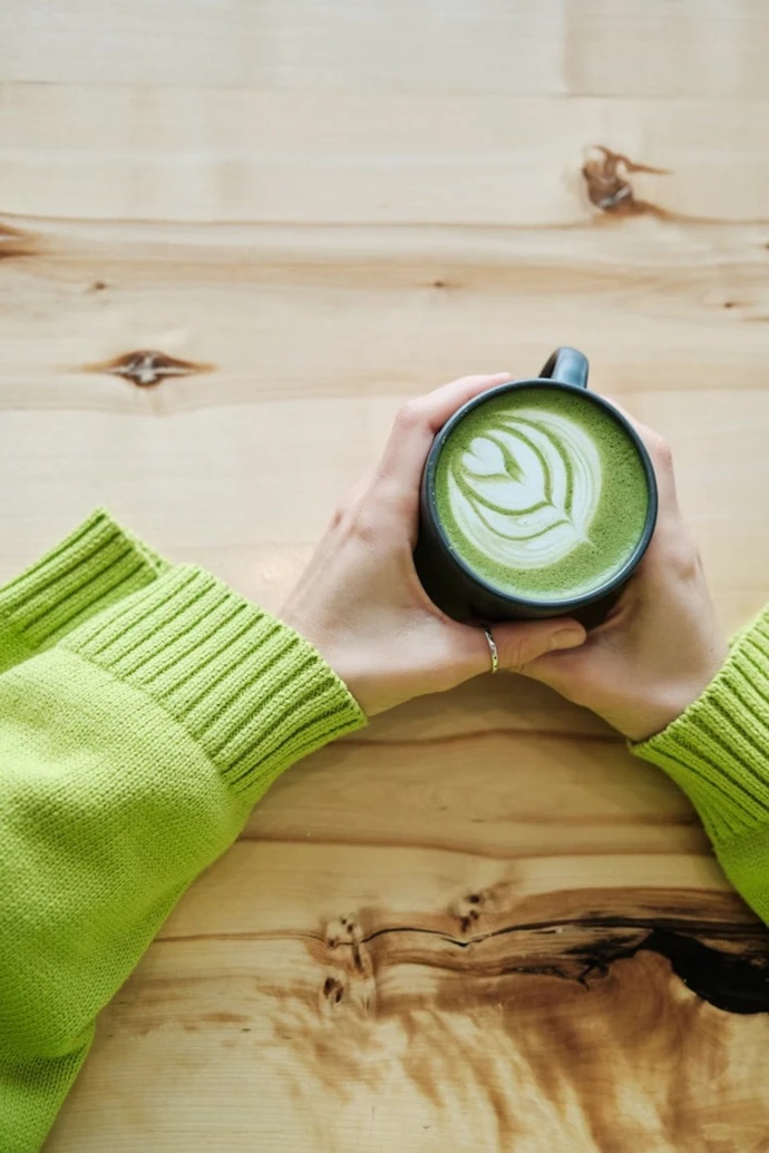
While the drink has been enjoying a global boom lately — served in major coffee chains, marketed as a great health and wellness product, and continuously promoted on social media — its popularity is also moving it away from the traditions of the Japanese tea ceremony.
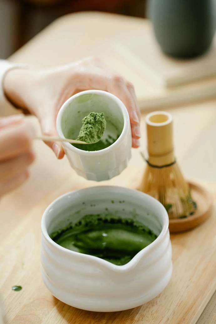
Matcha is rooted in stillness and mindfulness, meant to unlock a moment of calm. But the drink of the moment has turned into a trendy “to-go” beverage, with many consumers missing the very essence of what the matcha really represents. Each sip should bring matcha fans closer to the drink’s origins, offering them a full taste of Japan’s tea culture.
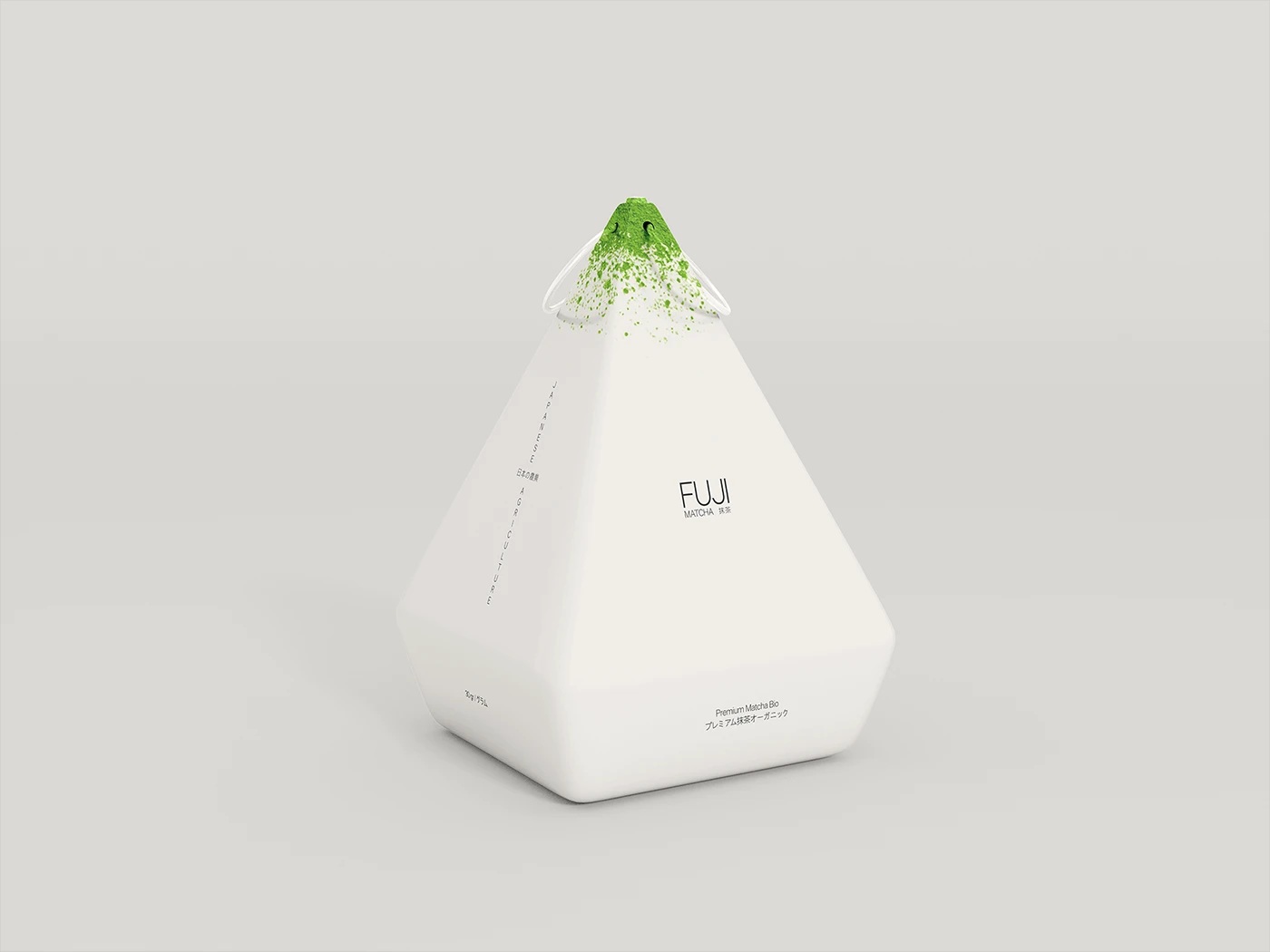
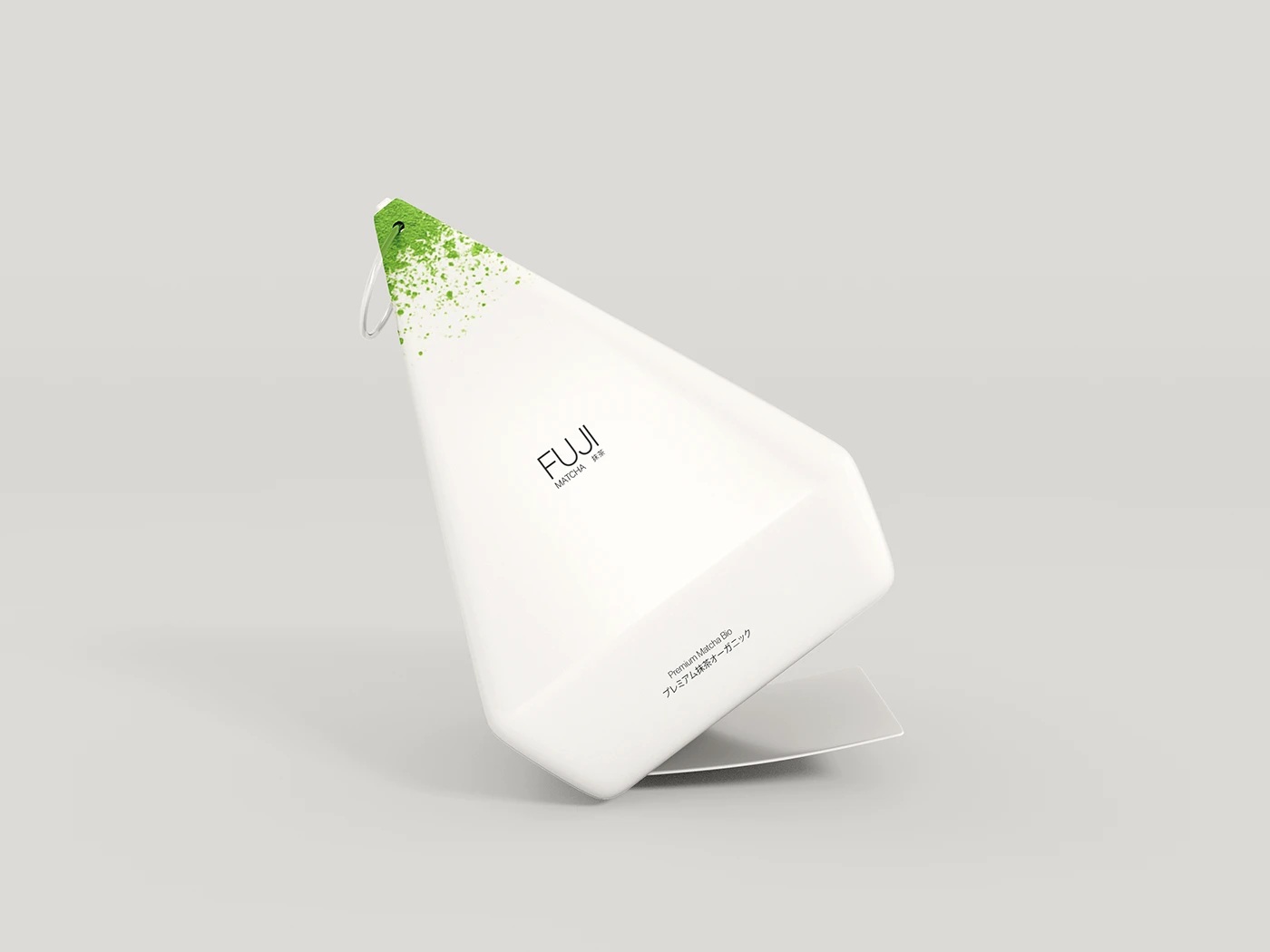
Fortunately, FUJI Matcha’s packaging design brings this connection back. Featuring a personalized iconography and inspired by the silhouette of Mount Fuji, the minimalist and elegant container visually communicates the relationship matcha has with the mountain.
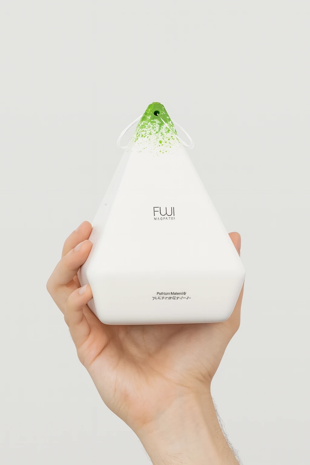
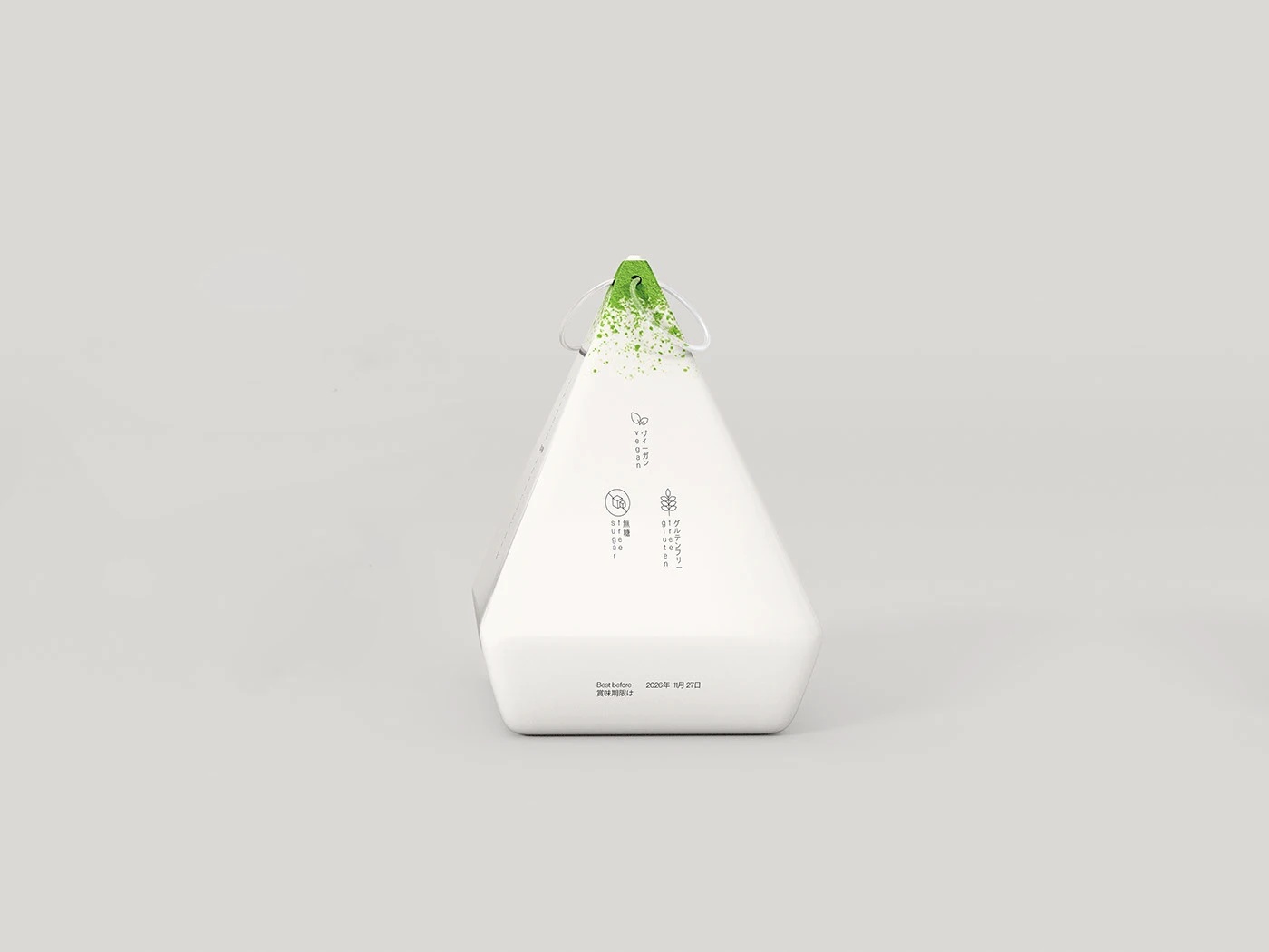
Shaped like a pyramid, the box is adorned with a subtle and elegant logo, while its monochrome palette contrasts with the splash of green color at the top, a visual reminder of the mountain’s snowy peak. This “subtle and intentional graphic application is a nod to the tea ceremony,” describes the artist.
The packaging is intended to go beyond a single use; the shape and the cord at the top of the box turn the container into a collectible object, inviting consumers to use it as they please — or simply hang it as a small decorative object in their house.
CREDITS
Concept Idea, Graphic Design, Art Direction & 3D: Marco Arroyo-Vázquez
Project Type: Concept
Industry: Beverages (Matcha)
Market Region: Europe, Asia