In December 2011, Cyclone Thane hit Tamil Nadu state and Puducherry, claiming the lives of 48 people. The impact was devastating in terms of forests and biodiversity as well, with Auroville’s forested areas losing approximately 75% of their tree cover. One tree species in particular — the Acacia auriculiformis — fell in large numbers. Commonly known as ear-pod wattle, the wood of this species stands out thanks to its durability, making it ideal for furniture. However, its characteristics make it a good option to be used as firewood.
Some people couldn’t just stand and watch the trees’ wood being reduced to ashes. Wanting to give it a meaning worthy of the quality of its wood, a workshop set out to craft long-lasting, high-quality wood products from the trees that fell during the powerful storm. Bearing the local name of the tree, Worktree, the manufacturer is committed to the environment and the community, designing products that are 100% natural wood.
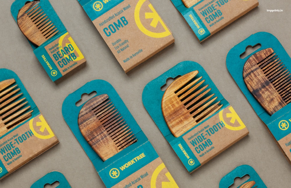
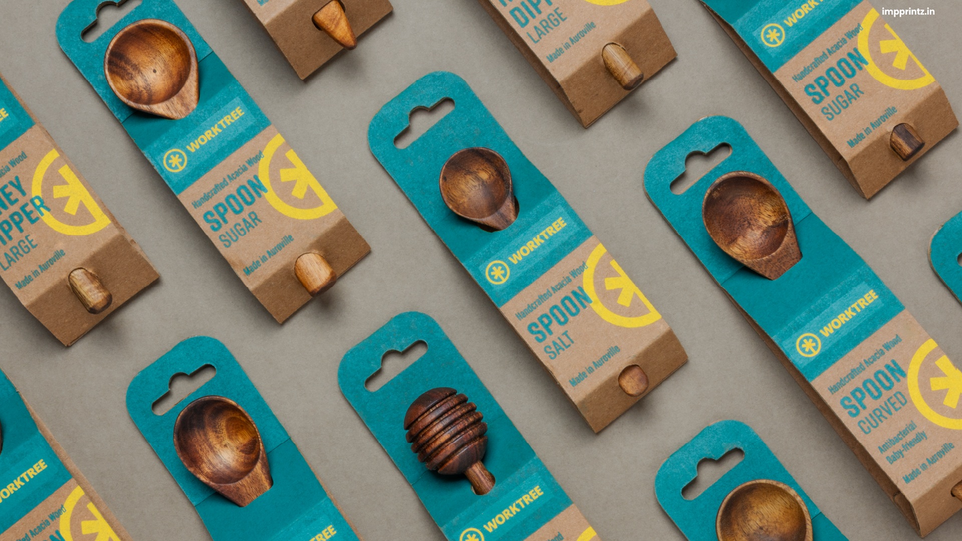
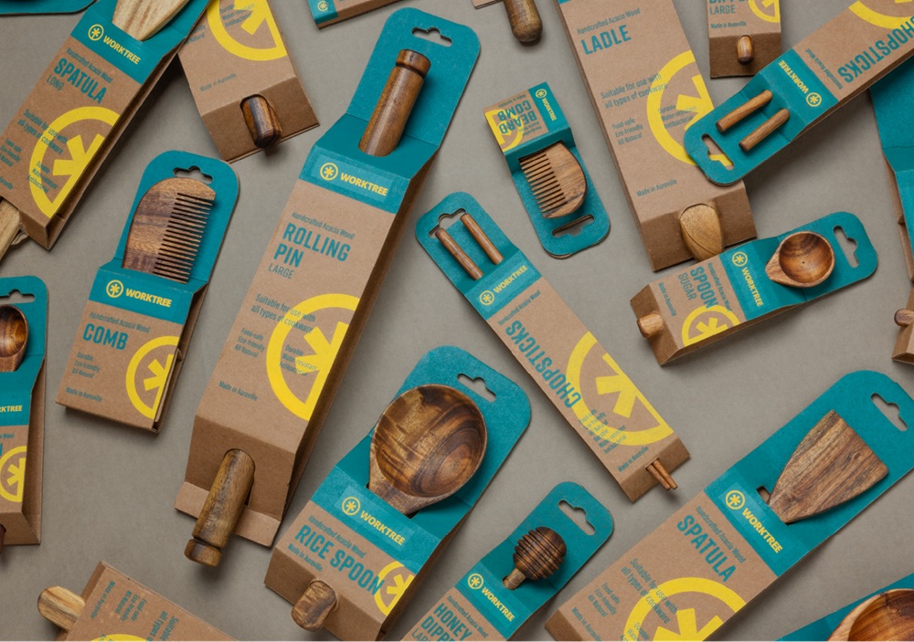
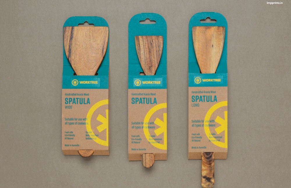
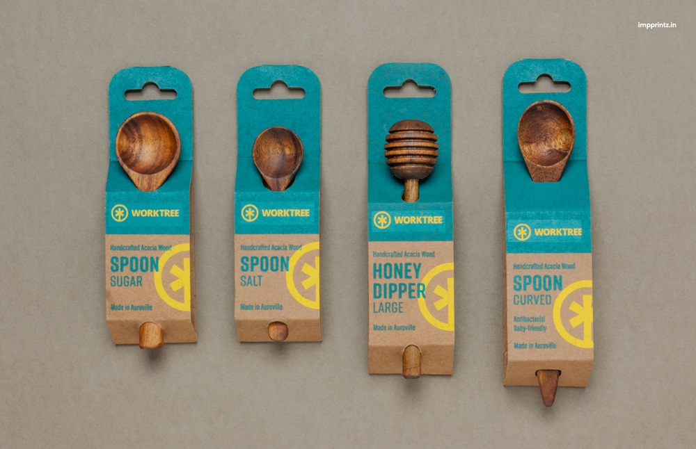
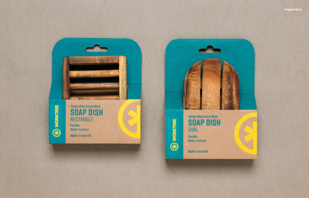
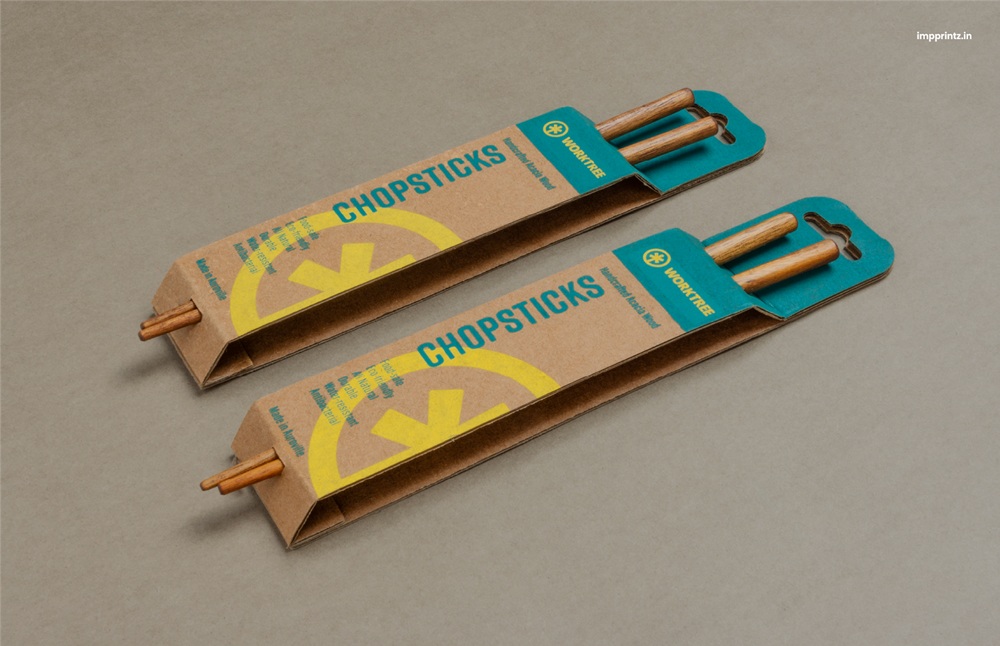
The brand makes everyday kitchen tools and tableware, accessories, and even toys. Designed with responsibly sourced Acacia wood, the products needed a packaging that reflects the company’s sustainability values, offers a better display of the items, and complements them in an eco-friendly manner. To help create the packaging, the workshop reached out to design studio Impprintz, which enhanced the products’ appearance with a design that creatively — and practically — fits the requests made by Worktree.
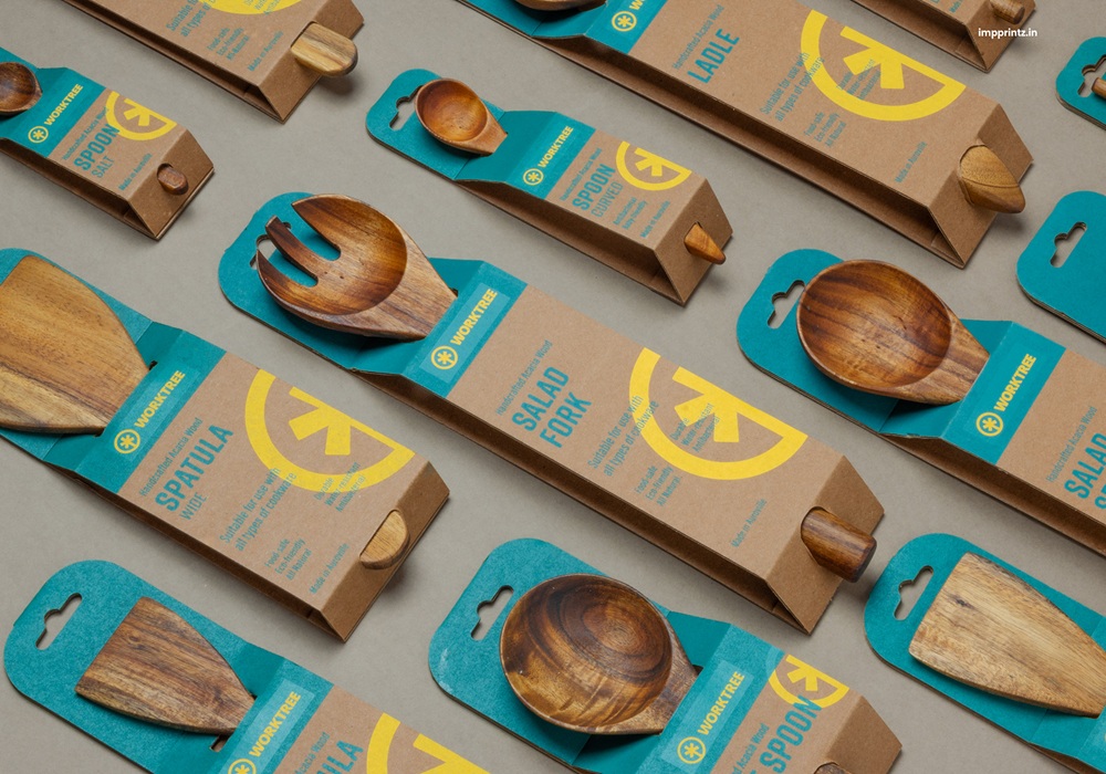
“The packaging had to be plastic-free while displaying as much of the product as possible. This led to the creation of eco-friendly packaging structures that can hold the products while having the ability to hang through the euro slots,” as per the studio.
In bringing the packaging to life, the creatives blended the use of corrugated kraft board with screen printing, thus adding a more natural and earthy aesthetic note to the products inside. The design system is meticulously developed to keep pace with the wide range of products, which differ in size, shape, and purpose. More precisely, it uses a simple and strong information distribution, making it easier for consumers to navigate through a product’s details.
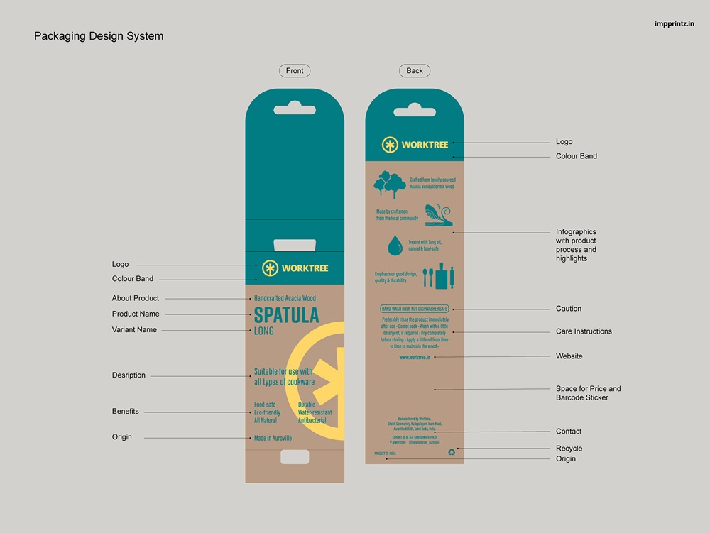
The color palette is an extension of the ones found in the brand’s signature colors. Thus, dark teal and yellow — Worktree’s hues — are injected into the packaging, adding a vibrant contrast to the overall design. Altogether, the new design enhances the brand and its products in multiple ways: Not only does it deliver clearer information, improved displayability, better brand visibility and a greater reflection of the brand’s character and authenticity, but it is also easy to stock and cost-effective.
CREDITS
Brand: Worktree
Agency: Impprintz