Co-founded by acclaimed actor Bahram Radan, the Scent of Qui fragrance house delivers perfumes that tell a story. Each of the six fragrances available is a mix of artistic craftsmanship with personal storytelling. Developed with the help of renowned perfumer Nathalie Feisthauer, the fragrances deliver memorable experiences that awaken new memories and evoke emotions.
With a clear ambition to establish an identity that resonates across international markets, the perfume house teamed up with Erahaus Creative Agency to sculpt an identity that perfectly matches the brand’s artistic spirit. From strategy to visual identity, the Dubai-based agency worked on designing a bold, minimal, and timeless experience that subtly communicates luxury and elegance.
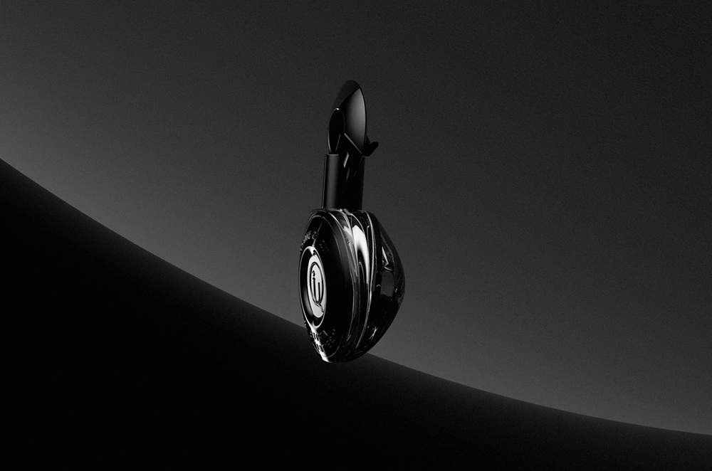
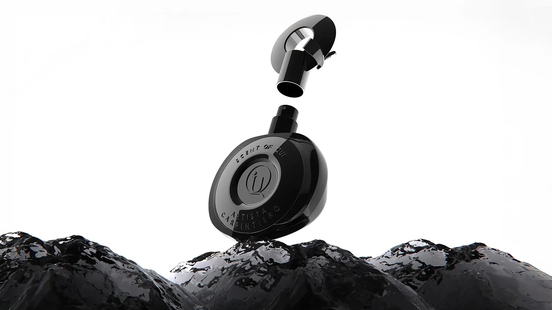
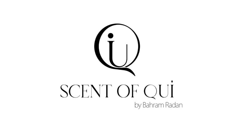
The brand’s central element, the logo, follows the silhouette of the letter “Q.” Stripped down to its geometry, the symbol serves not only as a visual reminder of the house’ name but also embodies the brand’s elegance, stillness, and intrigue. More than just a brand mark, the logo was crafted as a timeless character, to silently — yet visually — communicate across packaging, digital, and environmental design. The circular form, softly interrupted, expresses the intangible nature of scent; an experience that cannot be captured, only remembered.
In a category where the visuals must capture the invisible, the logo becomes the brand’s quiet and unforgettable signature. It was natural for the creatives to expand the logo and translate it into a full visual identity system that aligns with the brand’s artistic and poetic spirit. Built on contrast, with soft gradients set against structured forms, monochrome palettes highlighted by subtle hints of metallics, and a fluid typography that resembles scent itself, each element of the visual world of the fragrance house seems to be crafted with the same care and attention to detail as the fragrances themselves.
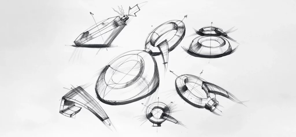
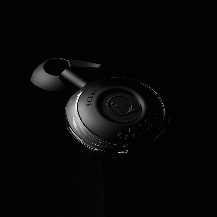
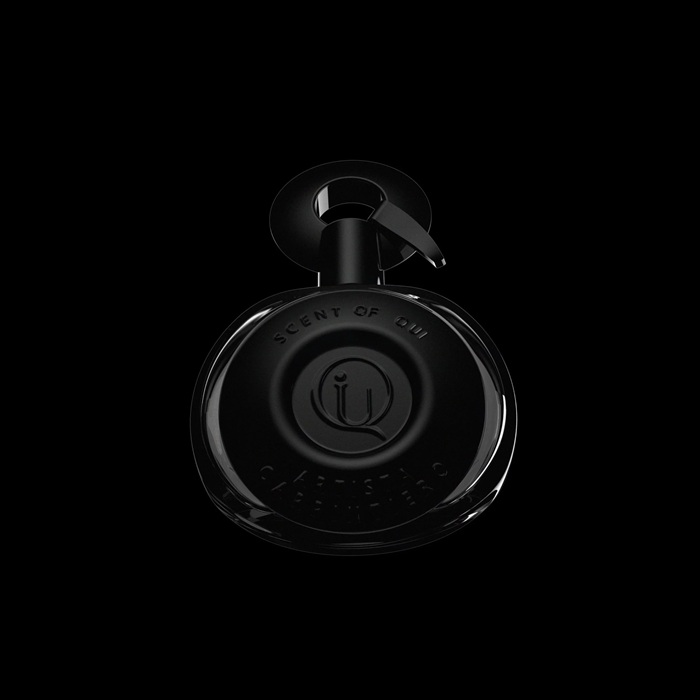
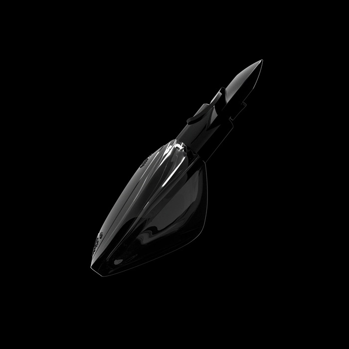
One of the most notable aspects of the collaboration was the development of the perfume bottle — the element designed to be the first tactile interaction between the consumer and the brand. In crafting it, Erahaus considered approaching it not as a vessel but rather as an object of art, an object that not only hosts scent but also unlocks memories. As such, a black bottle with soft matte finish and delicate details emerged, with a curvy silhouette for the wearer to maneuver with ease and confidence.
Its curved lines mirror the movement of the scent, whereas the lack of sharp angles echoes the fluid identity of the brand. “Every material was selected for texture, weight, and symbolic meaning. This is not just packaging, it’s a sensorial experience that begins the moment one lifts the cap. The bottle, paired with its minimalist packaging system, embodies restraint, confidence, and elegance,” as per the agency.
Scent of Qui made its debut at Esxence 2025, the world’s leading event for artistic perfumery, with Erahaus turning the brand into a multisensory experience. “The presence of Scent of Qui at Esxence 2025 is a defining moment for the brand, and we at Erahaus Creative Agency are proud to have played a pivotal role in bringing this vision to life. From conceptualizing the logo and crafting a distinctive brand identity to designing the sculptural perfume bottles, our team ensured that every element resonated with the brand’s storytelling philosophy,” commented the creative team.
In supporting the fragrance house’s presence at the event in Milan, the agency designed brochures, fragrance cards, large-format visuals, and branded messaging. The assets at the exhibition booth were conceived as an extension of the brand’s luxurious identity.
CREDITS
Brand: Scent of Qui
Artist & Storyteller: Bahram Radan and Alireza Khazal
Product Design Team: Emad Rahimi, Reza Kaboudmehri
Business development director: Arya Shahidi
Agency: Erahaus
Perfumer: Nathalie Feisthauer