Brands use several elements to contour their style and personality: the logo, packaging, design, tone of voice, colors, imagery, and typography. While all are important in helping a brand communicate to its audience, the font is crucial in how the market perceives a brand. Fonts express emotions and values and strengthen the bond between a brand and consumers. In the food industry, typography has evolved to mirror not only brand identity but consumer trends as well. Hand-drawn, playful, vintage or minimalist are amongst the fonts the food and beverage industry apply in their marketing. But how about fonts that emerge out of actual food?
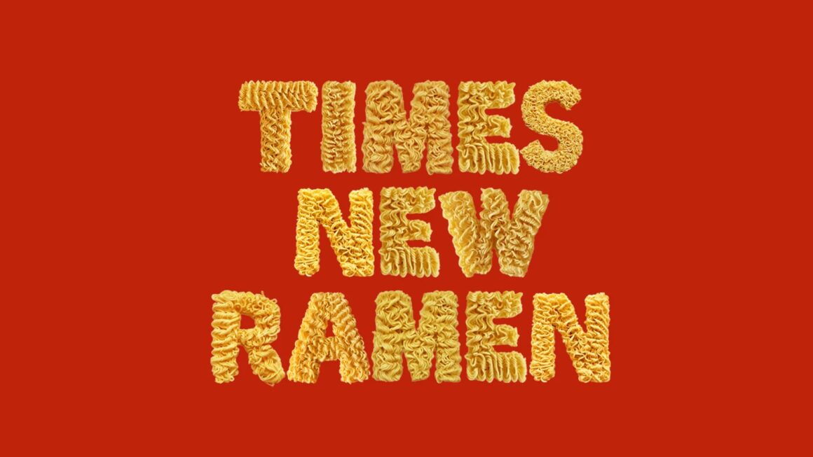
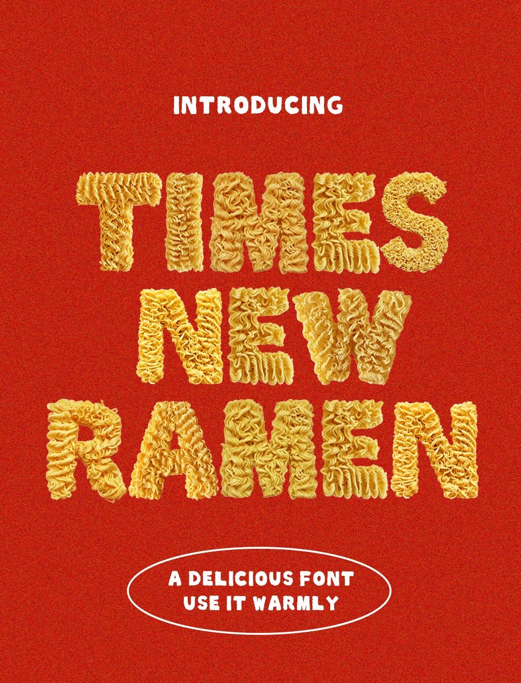
Senior Art Director at FCB Seine Kongruangkit tried it and developed the Times New Ramen font, a quirky typeface made entirely from instant noodles. The inspiration for this project came after the designer noted that “While ramen packaging has evolved to fit modern design trends, many brands still stay true to their traditional aesthetics.”
Relying on photography and Photoshop, the Chicago-based artist meticulously crafted the font, shaping the noodles into a typeface that is fully functional. According to the designer, the font is “perfect for menus, packaging, and more.” The Times New Ramen is made from images of instant noodles, which were then transformed into 3D letters.
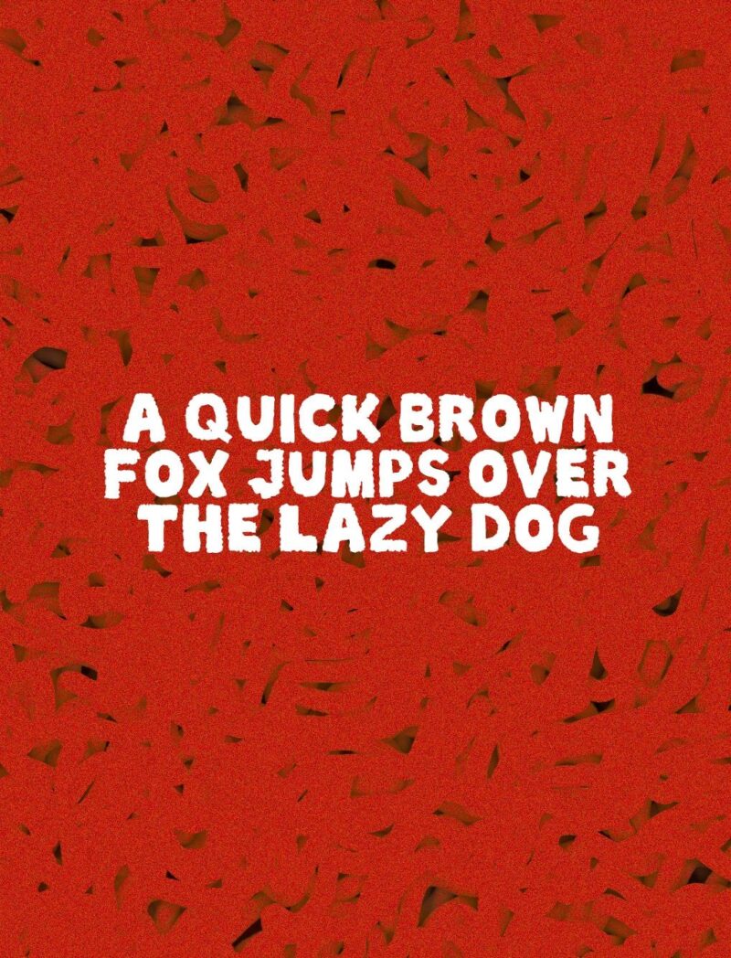
Available in capital letters in OTF, TTF, and PNG formats, the typeface is ideal to be used in headlines or other playful designs. While this might be the designer’s first and possibly last venture into font design, “my love for ramen will never die.”
Born and raised in Bangkok, Seine Kongruangkit is currently a Senior Art Director in Chicago. Beyond their 9-to-5 program, Seine channels their creativity into spotlighting the Asian culture, LGBTQ+ issues, and other causes close to their heart.
CREDITS
